Write your CSS (or Sass)
We want the rh-cool-element to have a profile photo, a username, and a follow button. Right now, it only contains the HTML structure, but we can style our element by updating our Sass (or CSS) to make it look the way we want.
We’ll be working in the /src/rh-cool-element.scss file since we decided to use the Sass option in the RHElement generator.
Your Sass file will initially import additional Sass from the rh-sass node module, but we can ignore that for now. The second part has a :host selector that makes our element display as a block element.
@import "../../rh-sass/rh-sass";
:host {
  display: block;
}

:host([hidden]) {
  display: none;
}
Now we can update our styles, like so:
@import "node_modules/@rhelements/rh-sass/rh-sass";
:host {
  display: flex;
  flex-direction: column;
  align-items: center;
  justify-content: center;
  width: 128px;
  padding: 32px;
  font-family: Arial;
  box-shadow: 0px 3px 1px -2px rgba(0, 0, 0, 0.2),
              0px 2px 2px 0px rgba(0, 0, 0, 0.14),
              0px 1px 5px 0px rgba(0, 0, 0, 0.12);
}

#profile-pic {
  width: 50px;
  height: 50px;
  margin-bottom: 16px;
  border: 2px solid #333;
  border-radius: 50%;
  background-color: #efefef;
}

button {
  margin-top: 16px;
}
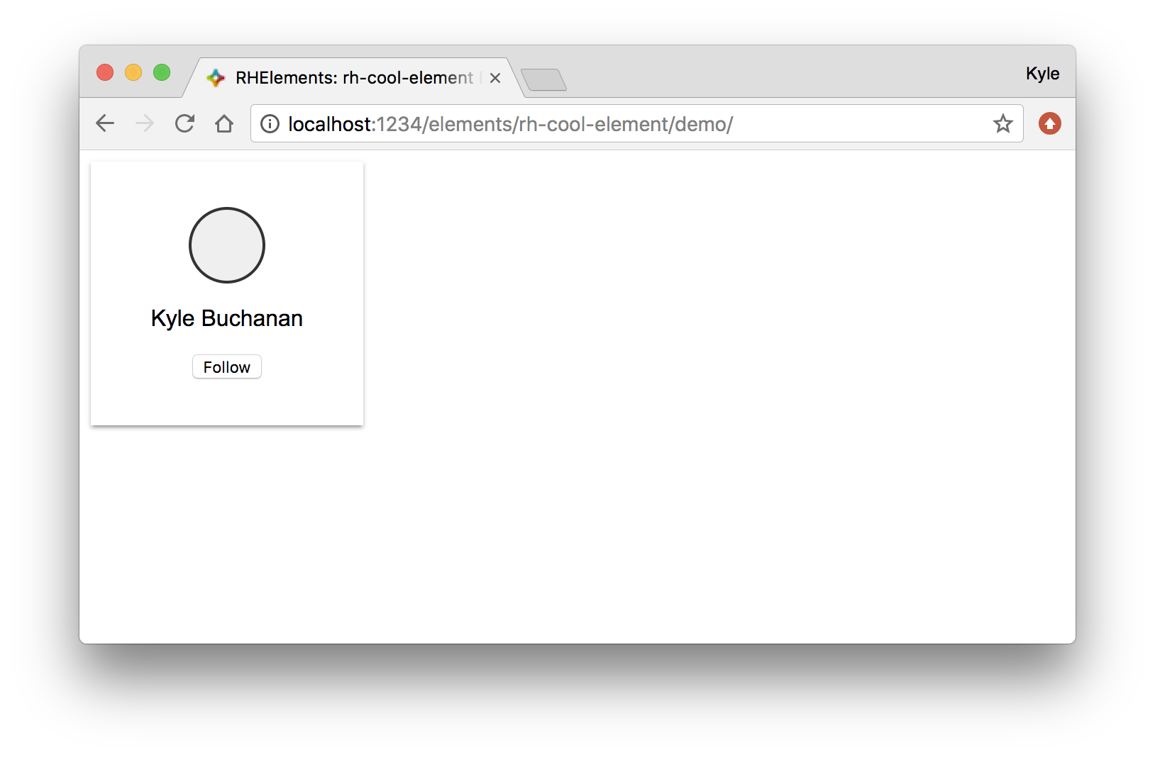
After saving and viewing our demo page, our profile element looks much better.
A couple of things to note:
1. The :host selector sets the styles of the container element <rh-cool-element>.
2. The button styles are encapsulated within this element and will not bleed out, meaning that there’s no worry of this it affecting other buttons on the page. Feeling confident that your element will always look the same when it’s distributed is one of the main advantages of the shadow DOM. Check out the Styling section of Shadow DOM v1: Self-Contained Web Components to learn what else you can do with styling the shadow DOM.
Now that our demo page is updated, let’s take a look at what happened to the ES6 version of the element in the root of our element’s directory.
import RHElement from "../rhelement/rhelement.js";

class RhCoolElement extends RHElement {
  get html() {
    return `
<style>
:host {
  display: flex;
  width: 128px;
  flex-direction: column;
  align-items: center;
  justify-content: center;
  padding: 32px;
  font-family: Arial;
  box-shadow: 0px 3px 1px -2px rgba(0, 0, 0, 0.2), 0px 2px 2px 0px rgba(0, 0, 0, 0.14), 0px 1px 5px 0px rgba(0, 0, 0, 0.12); }

:host([hidden]) {
  display: none; }

#profile-pic {
  width: 50px;
  height: 50px;
  border: 2px solid #333;
  border-radius: 50%;
  background-color: #efefef;
  margin-bottom: 16px; }

button {
  margin-top: 16px; }
</style>
<div id="profile-pic"></div>
<slot></slot>
<div>
  <button>Follow</button>
</div>`;
  }

  static get tag() {
    return "rh-cool-element";
  }

  get templateUrl() {
    return "rh-cool-element.html";
  }

  get styleUrl() {
    return "rh-cool-element.scss";
  }

  constructor() {
    super(RhCoolElement.tag);
  }
}

RHElement.create(RhCoolElement);
You’ll notice <style> contains everything we just wrote in our Sass file. Sass variables will also compiled their values and get included in the changes above.
Now that our rh-cool-element is more appealing, we’ll add the follow button’s interaction and fill in the profile photo. We can accomplish both of these tasks by updating the /src/rh-cool-element.js file.